Thursday, 16 December 2010

Audience Feedback

I asked a selection of people what genre they thought the magazine covered, the publication's purpose and intention and who they thought the target audience were simply by looking at the cover and contents page. In response to these questions, they were asked to consider features of my magazine front cover and contents pages and make remarks on aspects such as colour scheme, typography, photography etc.

How did they respond?

Genre: To the audience, the cover didn't seem to reflect 'indie' or electro music, as they suggested the colours and people photographed meant the magazine was about a different genre of music. They could only tell what the genre was by looking at the information in the contents. The response showed that I had not represented the genre well enough visually in the magazine.

Target audience (click to read my target audience profile): They felt that the colours and photography implied that it was aimed at a teenage/young adult and that the magazine appeals to all races as the cover suggested diversity in the music industry. This was intentional, because I felt that the magazine should have a wide appeal to ensure it is widely read. Only one of the people made a comment about the location of the magazine. I now feel that I should have emphasised this, perhaps the tagline 'London's ultimate new music monthly' was not visible enough.
The masthead colours seemed to suggest an older target audience, but the 'cartoon' pair of headphones appealed to a younger audience, thus making it appeal to a wider audience.


Purpose and intention: 
The audience felt there was an emphasis on concerts and gigs and that in general, the purpose of the magazine was to  inform the audience about music and popular culture and promote artists. The minimalistic layout showed that there was an emphasis on the information provided by the magazine. I wanted to use a minimalist layout so the magazine would be easy to navigate and read. I wanted to challenge the conventions seen in the music press by having lots of text and images on one page because the audience would be used to seeing this in the media, especially on websites. As well as being visually appealing, it would be more practical for the reader to see less text on the page.

Monday, 13 December 2010

Evaluation Question


Looking back at your preliminary task of designing the front page and contents of a school magazine what do you feel you have learnt in the progression of it to full product?

Comparison of the covers:


  • Whereas the preliminary task cover only uses one font, the full product cover uses a main font (Helvetica) and a different one for the feature story
  • The photography in the final product is also more suited to its purpose. The lack of objects makes the text more legible and the fact the audience can see the subjects' faces allows them to identify with them, an concept that relates to the uses and gratifications theory
  • The full product also incorporates more magazine conventions, such as the issue number and date
Furthermore, the planning required for the final task was much more developed than the preliminary task planning. For example, I used a flat plan to make my production more efficient. Additionally, the knowledge I gained about photography (iconography, shot types) when making the school magazine helped me think about how I wanted the music magazine to look. Learning about mise-en-scène was particularly helpful when it came to arranging the lighting, backdrop and actors in my photography.
 I also became more discerning when selecting the photos for the final publication, despite not being restricted to using a certain type of shot on the cover.


I developed my skills in Photoshop during the process of completing the product, learning more about layers and other techniques which sped up the production of my front cover and contents page.


Feature article from NME, October 2010
Looking extensively at existing publications helped me recognise the features of a magazine that I needed to include in my final project. Continuity features such as a page footer on the contents page and feature article page allow the reader to easily navigate through the magazine. I also summarised the contents of each section on the contents page, copying this from the examples of the music press I looked at.

The magazine's page footer shows the page number, the publication title, the publication date and the logo


Wednesday, 8 December 2010

Evaluation Questions

What kind of media institution might distribute your magazine and why?
View more presentations from balluk.

Evaluation Questions


View more presentations from balluk.

Evaluation Questions


View more presentations from balluk.

Evaluation Questions

Who would be the audience for your music magazine?   

This mood board gives some information about the target audience such as age, race, gender, location and interests
The magazine focuses largely on new music in the indie genre and other similar types of music. The style in articles would be quite informal without using colloquialisms to avoid being inaccessible for some readers, although it is largely aimed at people aged 16 to 24. The gender of readers would not be overwhelmingly male although this is a trend present throughout the music press. For instance, NME’s readership is 69% male and only 31% female.
NME reader profile January - June 2009


 The lifestyle of the readership would vary, from the younger readers attending school or college perhaps working part-time to slightly older readers in university or at work. The readership is informed on global matters and takes interest in issues more local to them like politics. They would have a low income due to working part time, relying on an allowance or working in low-level jobs as graduates. The audience access music in a range of ways; using the internet or music streaming programmes, listening to radio shows and television music channels, attending music festivals and gigs and downloading MP3s or buying CDs. They spend most of their disposable income on entertainment: music, video games, gigs and live events and films with the latter as social activities requiring them to spend money on clothes, food and transport. After entertainment, the audience spend most of their money on clothes. Other hobbies and interests may be performing in their own bands, volunteering, using social networking websites and playing sports. The type of advertising featured would mainly be promotions for albums and singles, films, video games and activist organisations as they are relevant to the readership’s interests. Inexpensive audio equipment such as headphones would be advertised due to their universality and relevance in a music magazine. 
 The uses and gratifications theory demonstrates how the content would fulfil the audience’s needs:


  •     Diversion: The publication provides entertainment through its light-hearted articles and features. Also, it encourages its readership to enjoy music whether at concerts and festivals or in the comfort of their own homes.
  •     Surveillance: Information about the music scene is offered in every issue’s news section and the gig guide is a listings page of events taking place every month.
  •     Personal Identity: Interviews published in the magazine may affirm the identity of the reader, for example, an artist based in London (where the publication is solely distributed) may mention areas in it which a reader would be familiar with.
  •     Personal Relationships:  Media such as magazines can be used within existing relationships, for instance, friends may discuss the content of ‘Sound’ with each other.


    How did you attract/address the audience for your music publication?
    In my article I attracted readers familiar with the type of artists featured in existing publications, such as NME and similar magazines that cover the same genre of music. I made it more relevant, satisfying the audience’s need for personal identity, to my audience through representation: the featured band is from London (the magazine will be based in and circulated throughout the city) and young. Descriptive terms such as 'eagerly anticipated' and 'innovative' are critical in captivating the reader, encouraging them to read on. The mode of address to an extent mirrors the style in which the audience communicate with each other, allowing them to relate to the publication better. The layout of the cover in comparison to very genre specific magazines such as Top Of The Pops or Kerrang! is rather minimal, making it appeal to a slightly older readership while the use of bright colours still will attract teenage readers. The typography used does not appeal to a niche market, but still reflects the style of music as exclusive and contemporary. 


    The use of capitalised text on the cover demands the attention of the audience, with language such as ‘exclusive’ appealing to music fans in search of new music. Moreover, the competition sticker is a lure to appeal to music fans, regardless of age. The magazine would promote itself to the intended audience in advertising space on websites. It would also have a presence on social networking websites in order to relate to the audience.


    The low cover price of £2.00 attracts readers from the target audience and widens the publication's appeal. I decided to price it slightly cheaper than established magazines (Kerrang!'s cover price is £2.20 while NME is priced similarly, both are published weekly) to persuade potential readers into buying it. My magazine is published on a monthly basis, priced lower than others published every week. This would appeal to teenagers who receive a small allowance from their parents or students working part-time jobs.

    Feature Article

    Feature Article

    Music magazine cover and contents


    Tuesday, 7 December 2010

    Design and Layout

    The above screenshot demonstrates how I have followed a conventional layout style in my product. I feel that the while the layout adheres to conventions instead of challenging them, this is necessary as the audience would be familiar with this kind of layout style as it is seen in a variety of existing magazines including Mixmag and NME. The bright colours are attractive and white, black and grey are used to add impact. I used a pale green colour for the background to make it easy to read against the black text. The typography, a mix of Helvetica in the body text and Geo Sans Light in the headline, byline and pull-quote, presents the content as non-traditional and interesting.
    The sans serif typography seen in the masthead and throughout the magazine reflects the content as it has a contemporary feel. The headphones logo appeals to the target audience, frequent users of mobile phones and iPods which require them. I specifically used black, white and grey in the masthead as these colours could fit i with almost any colour scheme used in different issues of the magazine.


    Monday, 6 December 2010

    Using Pages

    I used Pages to create my feature article. Using feature articles from NME and Mixmag as references, I included elements seen in existing publications such as a title, subheading, a dropped capital and a pull quote. I used a combination of fonts to make it the title, subheading and pull quote look stylised. For the body text, I used a simpler font that would be easier to read.
    For continuity, I also included a footer made in Photoshop with the magazine's logo, the issue number, date and page number
    Yet another continuity feature was the use of colour. The colour scheme of pink, green, grey and black was used throughout my publication.
    I created a pull quote using the text box function on Pages and included a photo of the artist on the page opposite the text, a layout seen often in NME. The colour background was made using a shape moved to the background and I changed the placement of the title and subheading in the final version.


    Thursday, 11 November 2010

    Publication Photography

    Using Photoshop

    For the cover photography, I simply made a few adjustments in the photograph's contrast and brightness. It was also cropped to fit the cover.

    The image on the contents page was made by selecting the actors as shapes from individual photos taken of them and transferring them onto a transparent background and then on to the contents page. I also used the layer style function to add shadows for extra impact.

    Monday, 8 November 2010

    Preliminary Task: Front Cover Analysis

    The strapline shows the reader the issue's highlights and the masthead is personal yet creative. The bright colours draw attention to the text and are eye catching for a younger audience. The tagline is brief enough to fit under the masthead, while including enough information for the audience to understand what the magazine's about.

    The main image is appropriate as it relates to the feature. It demonstrates how students learn actively at Acland Burghley school. The cover stories have a wide appeal to ABS students, La Swap students, teachers and parents alike. 
    The shape hints at the magzine's coverage of the arts and the web address engages a young audience.

    Forming ideas and flat planning.


    Brainstorming ideas for my publication: price, name and masthead font, target audience, magazine format and size, content, circulation, how frequently it is published etc.

    Flat planning for the contents page. I also experimented with different font styles on paper.
    A flat plan is a simplified version of a magazine which indicates what goes where which allows magazine editors and designers to visualise the features of the publication.

    Saturday, 6 November 2010

    Publication Typography

    As well as commenting on typography, I've also experimented with ideas for a masthead using different font sizes and colours. I think the third one is particularly effective as I can also use it as a logo (three letters on each line is the 'magic number' in  branding) inside the magazine, too.
    However, I decided to change the masthead font upon receiving some early audience feedback. I was told that this font would have been more appropriate for a magazine like Mixmag which focuses on dance and electronic music.

    Target Audience Profile

    Target Audience Full Profile:
    • Age Group: 16-25
    • Gender: Slight majority of male readers perhaps 55% male and 45% female 
    • Level of Education: Sixth form, college, HE or university students
    • Level of Income: Low, from allowance or part time jobs
    • Disposable Income: Most of their money is spent on entertainment (music, gigs, video games, films), clothing, transport, food, mobile phones and other similar technology 
    • Interests/Current Lifestyle: Attend gigs and festivals regularly, also spend money on other forms of entertainment and clothes, phone bills/credit. Mainly full time in education, some may work part time or do voluntary work
    • Aspirations: Want to go to university or if already in university want to graduate and enter professional careers
    • How do they communicate with each other? Social networking webistes, blogs, texting and phonecalls via mobile phones
    • Where do they live? Greater London, with a smaller number of readers living outside the area but working/going to school or going there on a regular basis

    Thursday, 4 November 2010

    Original photography for the preliminary task

    The cover photograph was given a contrast boost, brightened and cropped in Photoshop to make it a mid shot image.

    This photograph in the contents was also brightened and resized smaller to make it fit the page.

    The top of this photograph was cropped and it had greater contrast added in Photoshop to make the colourful artwork stand out against the white background.

    Comparative analysis and evaluation of two music magazine covers

    Q and Kerrang! magazines
    Similarities
    • Masthead
    • Features placed centrally
    • Mentions other features
    • Colour scheme limited to less than 5 colours including black and white
    • Banner showing other features
    • Taglines
    • Issue no, date, cover price, website, barcode     
    Differences
    • Q has less pictures, main focus is on featured artist
    • Kerrang! has names and pictures of other artists in the edition
    • Kerrang! has more images than text and three different fonts are used on the cover
                                                                 
    Kerrang!
    The generic music magazine conventions employed by Kerrang! suggest the target audience are 'alternative' males aged 15-21. This is evident in the fact that the title's name comes from a guitar noise heard in alternative rock music. The grungy, distorted typography on the masthead and other text gives the publication personality, an edge that shows they cater to the needs of a niche market; young fans of  rock music.

    The mode of address implies that the magazine's readership is young. Informal, non technical language is used on the cover and the offer of free posters in most editions confirms this as they are imperative in the young fan's adoration of their favourite rock stars. Aggressive language, e.g. 'crush', 'storm', 'uproar' demonstrates that it is aimed at young men in particular, as it is linked with traditional notions of masculinity.

    Q
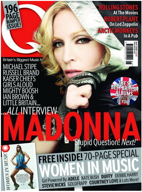
    Q magazine aims to provide its readers with "outstanding writing and photography, unparalleled access, extensive reviews" and this is evident from the above issue's cover. It promotes the feature article by name dropping industry figures which demonstrates that the magazine is targeted at older music fans who have some knowledge of the music industry and well established acts.
    The masthead is simply the letter 'Q' in a white serif font inside a red box. This type of font infers that the publication has an authoritative stance on the music industry while the colour white has connotations of exclusivity. The use of red is to allow older readers to be more familiar with the magazine, because older publications like Melody Maker, NME and Rolling Stone all at one point utilised the colour on their mastheads. Indeed, Q's masthead has changed little since it was founded in 1986.
    It is unclear which gender the magazine is marketed towards generally, although this issue's cover includes phrases such as 'girl powered' and female artists are well represented on the cover. Despite this, it is obvious that this is a special edition and there are far more older male entertainers listed on the cover as features. Also of note is the fact that the featured female artist is covered up, suggesting the publishers wanted to specifically appeal to women readers for this edition.