
Thursday, 11 November 2010
Using Photoshop

For the cover photography, I simply made a few adjustments in the photograph's contrast and brightness. It was also cropped to fit the cover.

The image on the contents page was made by selecting the actors as shapes from individual photos taken of them and transferring them onto a transparent background and then on to the contents page. I also used the layer style function to add shadows for extra impact.
Monday, 8 November 2010
Preliminary Task: Front Cover Analysis

The strapline shows the reader the issue's highlights and the masthead is personal yet creative. The bright colours draw attention to the text and are eye catching for a younger audience. The tagline is brief enough to fit under the masthead, while including enough information for the audience to understand what the magazine's about.

The main image is appropriate as it relates to the feature. It demonstrates how students learn actively at Acland Burghley school. The cover stories have a wide appeal to ABS students, La Swap students, teachers and parents alike.

The shape hints at the magzine's coverage of the arts and the web address engages a young audience.
Forming ideas and flat planning.

Brainstorming ideas for my publication: price, name and masthead font, target audience, magazine format and size, content, circulation, how frequently it is published etc.
Flat planning for the contents page. I also experimented with different font styles on paper.


A flat plan is a simplified version of a magazine which indicates what goes where which allows magazine editors and designers to visualise the features of the publication.
Saturday, 6 November 2010
Publication Typography

As well as commenting on typography, I've also experimented with ideas for a masthead using different font sizes and colours. I think the third one is particularly effective as I can also use it as a logo (three letters on each line is the 'magic number' in branding) inside the magazine, too.
However, I decided to change the masthead font upon receiving some early audience feedback. I was told that this font would have been more appropriate for a magazine like Mixmag which focuses on dance and electronic music.
Target Audience Profile

Target Audience Full Profile:
- Age Group: 16-25
- Gender: Slight majority of male readers perhaps 55% male and 45% female
- Level of Education: Sixth form, college, HE or university students
- Level of Income: Low, from allowance or part time jobs
- Disposable Income: Most of their money is spent on entertainment (music, gigs, video games, films), clothing, transport, food, mobile phones and other similar technology
- Interests/Current Lifestyle: Attend gigs and festivals regularly, also spend money on other forms of entertainment and clothes, phone bills/credit. Mainly full time in education, some may work part time or do voluntary work
- Aspirations: Want to go to university or if already in university want to graduate and enter professional careers
- How do they communicate with each other? Social networking webistes, blogs, texting and phonecalls via mobile phones
- Where do they live? Greater London, with a smaller number of readers living outside the area but working/going to school or going there on a regular basis
Thursday, 4 November 2010
Original photography for the preliminary task

The cover photograph was given a contrast boost, brightened and cropped in Photoshop to make it a mid shot image.

This photograph in the contents was also brightened and resized smaller to make it fit the page.

The top of this photograph was cropped and it had greater contrast added in Photoshop to make the colourful artwork stand out against the white background.
Comparative analysis and evaluation of two music magazine covers

Q and Kerrang! magazines
Similarities
- Masthead
- Features placed centrally
- Mentions other features
- Colour scheme limited to less than 5 colours including black and white
- Banner showing other features
- Taglines
- Issue no, date, cover price, website, barcode
Differences
- Q has less pictures, main focus is on featured artist
- Kerrang! has names and pictures of other artists in the edition
- Kerrang! has more images than text and three different fonts are used on the cover
Kerrang!
The generic music magazine conventions employed by Kerrang! suggest the target audience are 'alternative' males aged 15-21. This is evident in the fact that the title's name comes from a guitar noise heard in alternative rock music. The grungy, distorted typography on the masthead and other text gives the publication personality, an edge that shows they cater to the needs of a niche market; young fans of rock music.
The mode of address implies that the magazine's readership is young. Informal, non technical language is used on the cover and the offer of free posters in most editions confirms this as they are imperative in the young fan's adoration of their favourite rock stars. Aggressive language, e.g. 'crush', 'storm', 'uproar' demonstrates that it is aimed at young men in particular, as it is linked with traditional notions of masculinity.
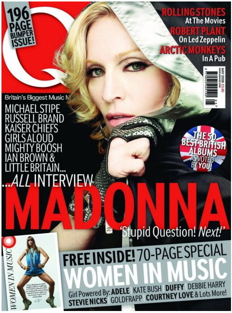
Q
Q magazine aims to provide its readers with "outstanding writing and photography, unparalleled access, extensive reviews" and this is evident from the above issue's cover. It promotes the feature article by name dropping industry figures which demonstrates that the magazine is targeted at older music fans who have some knowledge of the music industry and well established acts.
The masthead is simply the letter 'Q' in a white serif font inside a red box. This type of font infers that the publication has an authoritative stance on the music industry while the colour white has connotations of exclusivity. The use of red is to allow older readers to be more familiar with the magazine, because older publications like Melody Maker, NME and Rolling Stone all at one point utilised the colour on their mastheads. Indeed, Q's masthead has changed little since it was founded in 1986.
It is unclear which gender the magazine is marketed towards generally, although this issue's cover includes phrases such as 'girl powered' and female artists are well represented on the cover. Despite this, it is obvious that this is a special edition and there are far more older male entertainers listed on the cover as features. Also of note is the fact that the featured female artist is covered up, suggesting the publishers wanted to specifically appeal to women readers for this edition.
Wednesday, 3 November 2010


Subscribe to:
Comments (Atom)